DEADSWITCH°
DEADSWITCH° UV Lotion SPF 50

A self-initiated concept demonstrating the KOQEMUS Full Chain — from BRIEF Methodology through to visual identity and product design.

Work with KOQEMUS
↓  scroll
A dead man's switch keeps a machine running only as long as you're holding it. Release it, and everything stops.

This is SPF50 in that packaging.

01 — The Idea

Most SPF products ask you to forgive them for existing. Beige tubes. Clinical language. Packaging that disappears on the shelf and stays forgotten in the bag.

Sun protection is one of the most important things you put on your skin. The category treats it like the least interesting.

The question was: what does SPF look like if it doesn't apologise? What if the packaging made the protection impossible to ignore, the way hazard tape is impossible to ignore? What if the product looked exactly as urgent as the thing it protects against?

02 — The Name

The concept started as KILLSWITCH°. The name was right — urgent, industrial, one word. Then trademark research turned up filed 2021, registered 2022. The US market was blocked.

Renaming a concept at that stage usually means compromise. This time it didn't. A killswitch is something you press to stop a process — active, external, deliberate. A dead man's switch is the inverse: safety is maintained by your presence. The moment you stop, the protection stops.

DEADSWITCH° is the more precise name for a sun protection product. The trademark conflict made the concept better.

03 — The System

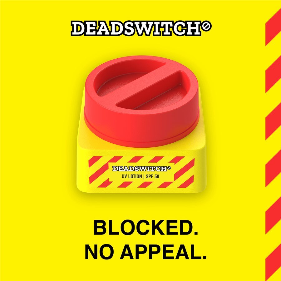
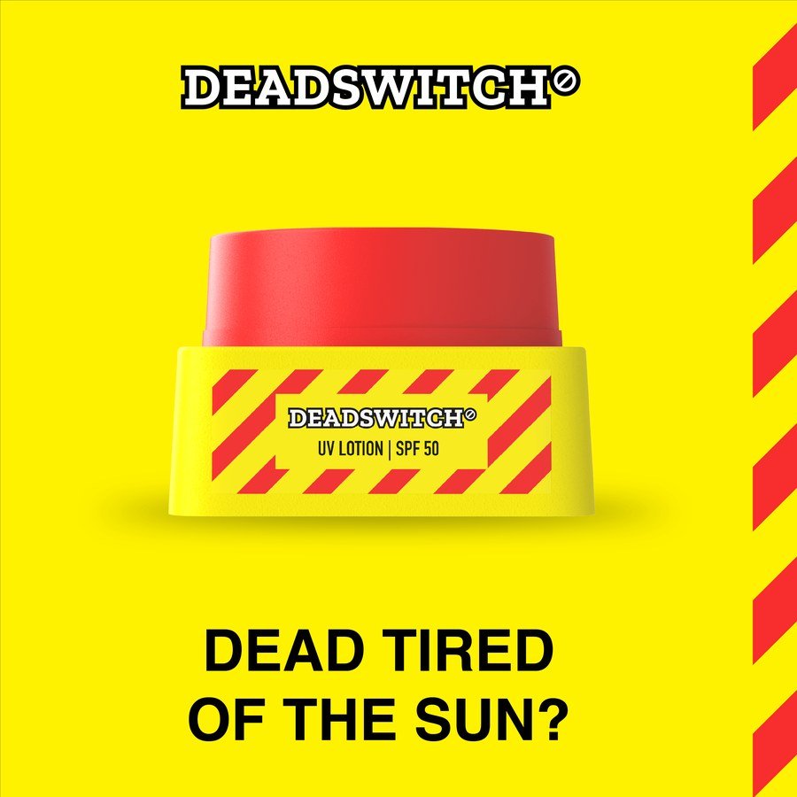
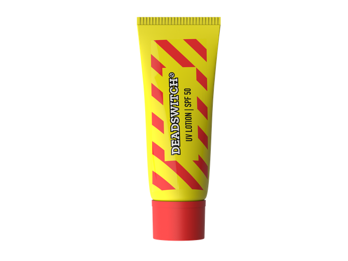
The cap carries a prohibition mark in relief, the ° in the wordmark made physical. The body runs hazard stripes: yellow and red, the international language of warning. The label reads UV LOTION | SPF 50, no softening, no category language. The name says what happens if you don't use it.

Red, yellow, black and white. That's the full palette. It doesn't negotiate with the category.

04 — The Detail

Injection-moulded PP. Interrupted thread, radial ribs, 3° draft on all vertical faces.

White-label SPF50. EU Cosmetics Regulation 1223/2009 compliant. EUTM Class 3 — no prior EU registration.

KOQEMUS BRAND FORENSICS · LIVE CASE STUDY · 2026
CATEGORY
AUTOPSY
Subject: EU Men's Sun Protection Market
Finding: Death by identity barrier
Examining brand: DEADSWITCH° UV Lotion SPF 50
Classification: Strategic
This page demonstrates KOQEMUS's brand strategy methodology applied to a live brief. Every section, ecosystem map, PESTEL, competitive dissection, positioning, is produced as a standard deliverable for any new brand or market entry engagement.
CASE FILE DS-001
⊘
CASE FILE DS-001 · EU MEN'S SPF MARKET
EXAMINATION DATE: JULY 2026

01, Cause of Death

The market was not failing
from a lack of information.

Primary Finding

Men know sunscreen protects them. They don't use it because the product requires them to identify as someone who uses skincare. That is not a knowledge gap. It is an identity barrier, and it is the category's actual cause of death.

Every incumbent has tried to close this gap with dark packaging, sport imagery, and words like "men's expert." None of it worked. The usage gap persists because the underlying product still reads as a cosmetic, it smells like a cosmetic, it feels like a cosmetic, it sits next to cosmetics on the shelf.

The solution is not to argue against that perception. It is to design a product so distinctively non-cosmetic that the category association never forms in the first place.

Contributing Factor 01

Category Language

Words like "lotion", "moisturising", "skin care routine" activate the same cognitive frame incumbents are trying to avoid. The product claims protection but communicates beauty ritual.

Contributing Factor 02

Shelf Positioning

Pharmacy and grocery SPF sits adjacent to women's skincare, face creams, and beauty. Context is brand communication. The shelf kills the positioning before the consumer reads a word.

Contributing Factor 03

Design Language Failure

Dark packaging and sport imagery are a surface-level patch. The format, tube, lotion bottle, squeeze pack, still reads as beauty. Format is the primary identity signal, not colour or typography.

The Structural Opening

Industrial Design Language

No brand in EU men's SPF uses industrial safety aesthetics as its primary design language. That visual vocabulary reads as a tool, not a product. It bypasses the barrier entirely.

⊘
CASE FILE DS-001 · EU MEN'S SPF MARKET
EXAMINATION DATE: JULY 2026

02, Specimen Inventory

Competitive specimens,
examined and tagged.

Each competitor dissected on three axes: design language, target orientation, and primary distribution channel. White space identified at the intersection all incumbents have left unoccupied.

SpecimenDesign LanguageTargetChannelFatal FlawVerdict
DEADSWITCH°
SUBJECT BRAND
Industrial / functionalMen-firstDTC + social-first N/A, White space occupant UNOCCUPIED POSITION
Nivea Men Sun
Beiersdorf AG
Sport-masculine cosmeticMen (not excl.)Retail-first Cosmetic language unchanged despite "men's" framing IDENTITY BARRIER INTACT
L'Oréal Men Expert
L'Oréal SA
Science-cosmeticMen (not excl.)Retail-first "Hydra Energetic" adds masculine vocabulary but product remains a face cream SURFACE PATCH ONLY
Supergoop!
US-origin, EU presence
Lifestyle / playfulUnisex / women-primaryDTC + prestige retail Proved DTC model for SPF; identity barrier for target male consumer untouched WRONG TARGET
EltaMD UV Clear
US-origin, EU pharmacy
Clinical / medicalUnisex / dermatologistDTC + pharmacy Relies on dermatologist chain; slow for mass male adoption WRONG CHANNEL
Daily Metal Stealth
2025 challenger
Gym / functionalMenDTC (early) Gym aesthetic rather than industrial. Not yet at EU scale. WATCH: CLOSEST RIVAL
Bondi Sands SPF50+
Australia / EU
Lifestyle / beachUnisex / youngerRetail + DTC Holiday framing limits year-round narrative; unisex dilutes identity play SEASONAL LIMITATION
Ambre Solaire SPF50+
Garnier / L'Oréal Group
Mass-market / lifestyle beautyUnisex / familyRetail-first Category-default aesthetics; broad family positioning reinforces the identity barrier DEADSWITCH° eliminates CATEGORY WALLPAPER
Piz Buin Moisturising SPF50
Kenvue (fmr. Johnson & Johnson)
Traditional / outdoor / holidayUnisex / outdoor / holidayRetail-first (pharmacy, travel) Heritage beach brand; holiday framing contradicts SPF-as-daily-protection; zero men-first positioning WRONG CONTEXT
Confirmed White Space

Industrial design language + Men-first + DTC/social-first. No competitor currently occupies all three simultaneously.

⊘
CASE FILE DS-001 · EU MEN'S SPF MARKET
EXAMINATION DATE: JULY 2026

03, Systems Anatomy

Nine actors. Mapped by
power concentration.

Power is concentrated upstream in regulators and ingredient suppliers. The DTC channel and creator layer represent the structural opening, both are accessible to a new entrant that bypasses the retail gatekeepers.

Veto, Highest

EU Regulators

ECHA, SCCS, European Commission. Set permissible UV filters, enforce packaging and labelling rules.

Build formula on compliant filters from day one. Treat PPWR Aug 2026 as brand asset, not compliance burden.
Technical Gatekeeper

UV-Filter Suppliers

DSM-Firmenich, Ashland, BASF. Control which UV filters reach market; drive reformulation cycles for incumbents.

Prioritise Tinosorb S/M, Uvinul A Plus, next-gen filters with clean regulatory status.
High, Production

Contract Manufacturers

White-label producers enabling entry-level scale without factory CapEx.

Retain formula ownership. Manufacturer is an execution partner, not a co-creator of brand IP.
High, Distribution

Incumbents

Nivea, L'Oréal, Eucerin, Bondi Sands. Own pharmacy/grocery shelf; set category visual language.

Do not compete on shelf. Make shelf irrelevant via DTC and social-first launch.
Medium, Gatekeeping

Retailers

Pharmacy, grocery, travel retail. Grant or deny physical shelf access and extract margin.

Phase 1: bypass. Phase 2: enter as a pull product once brand identity is established online.
Rising, Trust Conduit

Social Creators

Replacing pharmacy as the primary SPF credibility channel for 18–35 consumers.

Seed with sport, outdoor, derm-adjacent creators. Authentic review over paid reach.
Primary Target

End Consumers

Men 25–45, EU. High identity sensitivity on grooming choices. Know SPF works. Do not use it.

Remove identity friction. The product must read as a tool, not a beauty product.
Low–Medium (Fragmented)

Challengers

Supergoop!, EltaMD, Daily Metal Stealth. Proving DTC and social model works for SPF.

Monitor for positioning overlap. None currently occupies Industrial + Men-first + DTC simultaneously.
Infrastructure

DTC Platforms

Shopify, Amazon, brand.com. Determine discovery, fulfilment economics, and data ownership.

Own the .com channel. Amazon as secondary overspill. Customer data is the long-term brand asset.
⊘
CASE FILE DS-001 · EU MEN'S SPF MARKET
EXAMINATION DATE: JULY 2026

04, Toxicology Report

External forces bearing
on the category body.

29 PESTEL forces mapped. Key findings below. REG-ENFORCED = in force  ·  REG-UPCOMING = legislated, not yet applied  ·  MARKET = commercial dynamics.

Political
4-MBC Ban confirmed May 2025
Formulas using this filter require replacement. New brand has no legacy exposure, build around compliant actives from launch.
REG-ENFORCED
Political
Homosalate restricted Jan 2025 (max 7.34%)
Incumbents dependent on Homosalate face reformulation. DEADSWITCH° avoids by not adopting it.
REG-ENFORCED
Political
Octocrylene under SCCS consultation Sept 2025–Mar 2026
Outcome uncertain. Avoid Octocrylene to eliminate forward reformulation risk entirely.
REG-UPCOMING
Political
PPWR applies August 2026
Recycled content, end-of-life labelling become mandatory. New brand designs for compliance as a brand asset, not a retrofit.
REG-UPCOMING
Economic
EU SPF market ~8% CAGR 2024–2029
Category expanding; premium segment outgrowing mass. Price positioning at €25–35 structurally supported.
MARKET TAILWIND
Economic
Online SPF +18% YoY 2025
DTC economics increasingly viable. CAC falling as category search volume grows.
MARKET TAILWIND
Social
Masculine identity barrier, core adoption blocker
35–45% of target consumers perceive SPF use as feminine or vain (synthesised estimate, directional). Industrial design language is the removal mechanism.
STRENGTH 3 BARRIER
Social
Melanoma rising 3–7%/year in Europe
Growing ambient health awareness creates structural tailwind for SPF normalisation. Use-case becomes year-round, not seasonal. (Source: ECIS data)
HEALTH TAILWIND
Technology
Next-gen UV filters: Tinosorb S/M, Uvinul A Plus
EU-approved, high efficacy, no endocrine-disruptor concerns. "Built without compromised ingredients" is a defensible product claim.
FORMULA ADVANTAGE
Technology
Social commerce now primary EU sales channel
Distribution and brand-building can occur in the same channel. Eliminates need for separate retail strategy at launch.
CHANNEL SHIFT
Environment
Climate change extending UV season into Northern Europe
Category demand becomes structural, not seasonal. Changes the daily-use narrative and makes year-round positioning viable.
MACRO TAILWIND
⊘
CASE FILE DS-001 · EU MEN'S SPF MARKET
STRATEGIC ANALYSIS

05, Strategic Themes

Five forces the brand is built to exploit.

The PESTEL and ecosystem analysis produced five structural themes that define DEADSWITCH°'s strategic position. Each theme identifies a gap, a tension, or a shift in the category that the brand is specifically designed to address.

ST-01

The Masculinity Unlock

The usage gap is not an information deficit — men know SPF protects them. It is an identity barrier. Industrial safety design language (hazard stripe, functional packaging, technical nomenclature) reads as a tool, not a beauty product. DEADSWITCH° bypasses the barrier rather than arguing against it.

ST-02

Regulatory Churn as Competitive Moat

Four UV filters banned or restricted in the EU since 2024. Incumbents face continuous reformulation cost and brand disruption. A new brand built on a compliant-from-launch filter stack turns competitors' compliance burden into a product claim: no compromised ingredients, designed for the regulation others are retrofitting to.

ST-03

Creator as Dermatologist

Social creators with skin-health positioning are replacing pharmacy recommendations as the primary SPF credibility channel. A 60-second TikTok review from a verified creator now achieves what required clinical relationships in 2020. Strategic seeding in outdoor, fitness, and sport verticals reduces CAC while building authentic brand credibility.

ST-04

DTC as Identity Infrastructure

DTC is not just a distribution choice — it is a brand architecture decision. Owning the purchase journey controls the unboxing, the product narrative, and post-purchase communication without shelf adjacency to Nivea and Garnier. Social commerce closes the gap between discovery and purchase in ways retail contracts structurally prohibit.

ST-05

Packaging as the Product Claim

For men who do not read skincare packaging, the container communicates the brand before any copy is read. The industrial format, hazard colourway, and functional material language make the positioning argument without requiring consumer engagement with text. PPWR compliance adds a second claim: designed for the regulation competitors are scrambling to retrofit.

⊘
CASE FILE DS-001 · EU MEN'S SPF MARKET
EXAMINATION DATE: JULY 2026

06, Verdict

The diagnosis is clear.
The prescription is exact.

"For men who see standard SPF products as irrelevant to their identity, DEADSWITCH° is the sun protection brand that makes protection impossible to ignore, because its design language comes from the world of industrial safety, not the beauty aisle, and its SPF 50 formula is built without legacy ingredient compromises."

White Space Claim
Design Language
Industrial / Functional
+
Target
Men-First
+
Channel
DTC / Social-First
=
Status
Unoccupied
Brand Promise

Protection for people who don't use sunscreen.

Names the real target directly. The person who reads it feels seen rather than sold to. Every incumbent has tried to convert the non-user with information, DEADSWITCH° simply designs for them.

Archetype

The Outlaw

Incumbents default to The Caregiver. DEADSWITCH° refuses that frame, principled refusal to present protection as a beauty ritual.

Brand Core

Make protection impossible to ignore

By designing a product so distinctively non-cosmetic that it removes the identity barrier that makes most SPF invisible to its most important audience.

Tone of Voice

Blunt. Self-assured. Technically honest. Deadpan.

Statements, not persuasion. Names ingredients. Humour that doesn't announce itself.

Tone of Voice, Operating Rules
RegisterWe doWe don't
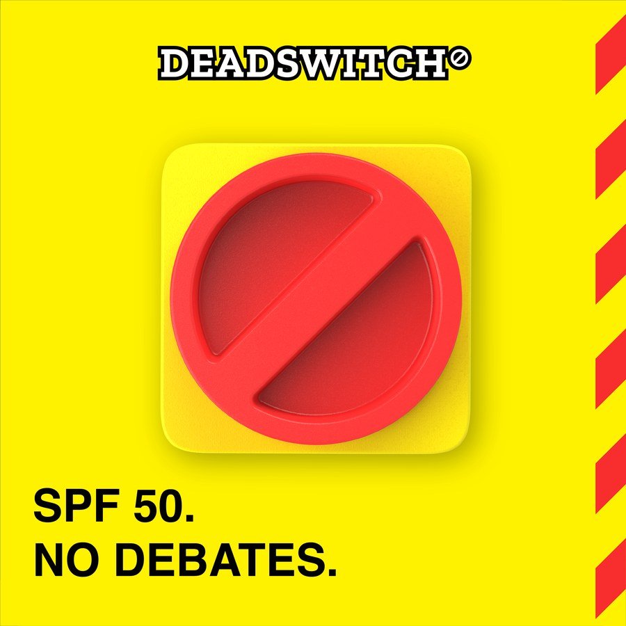
BluntDirect statements. "SPF 50. No debates." "Put it on."Hedge or qualify. "May help support healthy skin…"
Self-assuredAct as if product quality is self-evident. Describe without defending.Lead with "dermatologist-approved" as the primary claim.
Technically honestName the filters. "Tinosorb S, stable under UV. No degradation."Vague language. "Advanced formula." "Science-backed."
DeadpanHumour that doesn't announce itself. Copy that rewards a second read.Slogans. Exclamation marks. "Amazing!" "Life-changing."
mark
CASE FILE DS-001 · EU MEN'S SPF MARKET
EXAMINATION DATE: JULY 2026

07, Visual Identity

The brand in form.
Every element earns its place.

The visual system is built on the same logic as the positioning: industrial, functional, non-cosmetic. Nothing is decorative. Each element has a specific job, to remove the beauty-category association before the consumer reads a single word.

Brand Identity Elements
Brand symbol

Brand Symbol

The prohibition mark, used independently at any scale where the full wordmark cannot fit. Cap hardware, document headers, embossed labels, status indicators. At its most reduced, it is the brand.

DEADSWITCH° logotype

Logotype

The full wordmark in a heavily outlined block typeface. Used for primary brand moments: packaging front, OOH, campaign, and any context where the brand needs to be legible at first contact. The prohibition mark is embedded as the degree symbol, mark and wordmark are inseparable.

Colour System
#FFF200
Hazard Yellow
Primary canvas. Industrial warning colour. Occupies the same visual register as site-safety tape, high-visibility workwear, and chemical hazard signage. In a beauty-shelf context, it reads as a tool.
#E8350A
Alert Red
Urgency and consequence. UV damage, sunburn, skin cancer risk. Used for status indicators, action states, and emphasis, never as decoration.
#111111
Technical Black
The colour of industrial documentation, safety manuals, and machinery. Primary text colour. At full weight it reads as authority, not elegance.
#FFFFFF
Document White
Clinical surface. The colour of product data sheets, test results, and compliance documentation. Used as the card and label ground.
Brand Texture, Hazard Pattern

The diagonal hazard stripe is the brand's primary surface texture. It signals construction zones, site safety, and industrial warning in every context it appears, packaging trim, section dividers, campaign backgrounds, label accents. The pattern is always Hazard Yellow (#FFF200) and Alert Red (#E8350A): the brand's two action colours in direct collision. Never used directly behind body text, text always sits on a clean yellow or solid colour panel. The stripe pattern frames and borders those panels as a structural element, marking transitions and boundaries.

Typography
Protection for people who don't use sunscreen.
Helvetica Neue Bold
The typeface of industrial safety manuals, pharmaceutical labelling, and airport wayfinding. No personality of its own, it gets out of the way of the message. At high weight and large scale it reads as a declaration, not an invitation.
CASE FILE DS-001
TINOSORB S  ·  UVINUL A PLUS
SPF 50  ·  EU COMPLIANT
EXAMINATION DATE: JULY 2026
Share Tech Mono
Reserved for technical and forensic notation: case references, ingredient names, status codes, compliance markers. Monospace signals precision and objectivity, specification language, not marketing copy.
Direction — Marketing Materials

Finished campaign assets demonstrating the visual language in market context.

Social — Icon Post
Social — Product Post
Social — Statement Post
Display — Leaderboard Banner
Direction — Brand Extensions

Merchandise demonstrating how the visual identity extends beyond packaging into wearable brand objects.

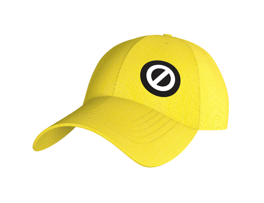
Apparel — Cap

The mark moves off the shelf and onto the body. A UV-yellow cap with the DEADSWITCH° icon makes protection wearable as a statement, something you choose to be seen in, not something you hide. Functional UV shielding meets hazard-signal aesthetics: conspicuous by design.

Apparel — T-Shirt

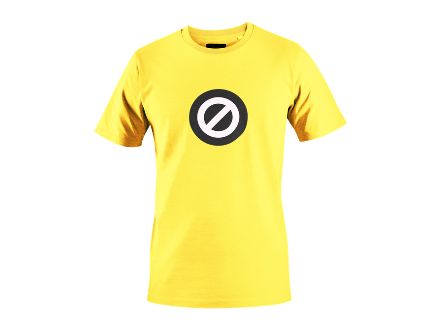
The same mark, on yellow, no explanation required. The fabric is UV-protective, the brand's core function built into every thread. Extends the brand into lifestyle without diluting the identity, the icon carries it alone. Yellow + black + the slash: protected, not subtle about it.

⊘
CASE FILE DS-001 · EU MEN'S SPF MARKET
EXAMINATION DATE: JULY 2026

08, Product Line Extension

The tube.
Same brand. Different occasion.

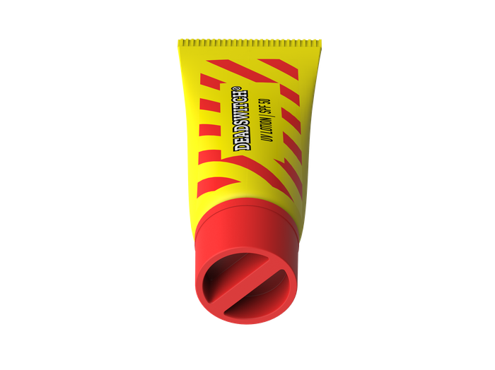
The DEADSWITCH° tube is not a new product, it is the same protection in a different form factor. The jar owns the shelf. The tube owns the moment of use. Both are needed, but in the wrong order they damage each other.

Product, Mark
Format, Tube Cap-Down
Format, Tube Upright

When this launches

Only after the jar has established brand recognition, minimum 18 to 24 months post-launch. The jar is the brand's hero object, it creates the mental model for DEADSWITCH°. Launching the tube too early turns the brand into a format portfolio before it has an identity. The jar must own its space first. When consumers already know what DEADSWITCH° stands for, the tube reads as range depth. Before that, it reads as brand confusion.


Use cases the tube unlocks

The jar is a shelf product, a deliberate purchase with a place in a bathroom cabinet. The tube addresses a different set of occasions: sport and active use where squeeze application beats a jar, carry-on travel at 100ml, gym bag and beach bag portability, and trial-size SKUs as acquisition vehicles for consumers not yet ready to commit to the full format. These are genuinely separate occasions, which means cannibalization risk is low if the positioning is clear.


Pricing implications

The tube must not undercut the jar on a per-milliliter basis. Two viable approaches: parity pricing by volume, same cost per ml at a lower absolute price point because of smaller fill, or a slight premium for an active/sport positioning. Pricing the tube below the jar's per-ml rate devalues the core product and erodes the brand's not-a-basic-sunscreen positioning. The tube should feel like a deliberate format choice, not a cheaper version of the same thing.


Logistics considerations

A tube SKU means a separate fill line, different packaging machinery, different shelf placement and potentially different retail channels. Sports retailers, travel sections and impulse fixtures handle tube format differently to the shelf placement the jar occupies. Two SKUs require separate demand forecasting, separate safety stock, and potentially separate distributor relationships if sport retail is pursued. Supply chain complexity roughly doubles from a single-SKU operation. This is a meaningful operational commitment, not just a design change.


Strategic considerations

The tube is the same brand, same visual identity, different form factor. It should not be treated as a sub-brand or variant line, it is DEADSWITCH° in a tube. SPF variants, SPF 30 or SPF 50+, can follow once the two formats establish category breadth. Jar plus tube plus apparel creates a brand that owns sun protection as a lifestyle category rather than a single product. That is the architecture this brand is building toward, but the jar has to be the undisputed entry point first.

CASE DS-001, EXAMINATION COMPLETE
DEADSWITCH°
Protection for people who don't use sunscreen.
CAMPAIGN · SPF 50. BUILT FOR THE PERSON THE CATEGORY FORGOT.

A self-initiated concept demonstrating the KOQEMUS Full Chain — from BRIEF Methodology through to visual identity and product design.

Work with KOQEMUS